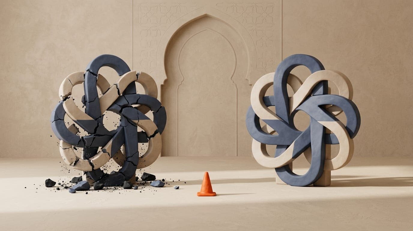
A failed logo is expensive: you have to redo it, reprint everything and get customers used to it again. These are the mistakes I fix most often when a business comes to me for a redesign.
1. Trying to say everything
A logo doesn't need to show all your services. It needs to be recognisable. Big brands often come down to one shape and a name.
2. Following the trend of the moment
Extreme gradients, 3D effects, the font everyone uses: what's trendy today will look dated in three years. Aim for simplicity; it ages better.
3. Forgetting small sizes
Your logo will appear as a profile icon, on a pen or at the bottom of an invoice. Test it very small: if it's no longer legible, it's too busy.
4. Having only one version
You need at least a horizontal version, a compact one, a single-colour one and a light version for dark backgrounds.
5. Choosing on personal taste alone
The logo has to speak to your customers. A colour you love can send the wrong message in your industry.
6. Not getting the source files
Insist on vector files (SVG, AI or PDF). Without them, you can't properly print a shop sign or a banner.
7. Stopping at the logo
Without usage rules, every new item ends up with different colours and fonts. A set of brand guidelines prevents that drift.
Going further
See how I work on the logo design page, or read the article on what a logo costs in Morocco.
- #logo
- #brand identity
- #tips
Written by YassineGraphic designer and web / SEO consultant in Casablanca.